Why Marketing Data Visualization Matters More Than Ever
Did you know that 90% of the world’s data has been created in just the last two years, yet less than 0.5% of it is ever analyzed or used? For business owners and marketers, this is both a challenge and an opportunity. The difference between a thriving campaign and a wasted budget often comes down to how well you can visualize—and act on—your marketing data.
With digital marketing channels multiplying and consumer journeys becoming more complex, raw numbers alone just don’t cut it. Data visualization transforms your marketing data into visual stories that drive smarter decisions and measurable results. In 2025, the most successful marketers are those who can quickly spot trends, diagnose problems, and communicate insights through compelling visuals.
But what does that actually look like in practice? Let’s dive into seven powerful marketing data visualization examples—and how you can use them to unlock growth.
1. Funnel Charts: Pinpoint Drop-Offs in Your Customer Journey
Pain Point: Are you losing prospects between ad click and purchase, but unsure where?
How It Works: Funnel charts visualize each step in your marketing or sales funnel—from impressions to clicks, sign-ups, and conversions. By showing how many users drop off at each stage, you can identify friction points and prioritize fixes.
Example:
- In Shopify, an ecommerce dashboard uses a horizontal funnel to display the journey from ad view to completed purchase. Marketers can see if most users abandon after adding to cart or if drop-off occurs earlier, such as during form fills.
Actionable Tip:
- Use funnel visualizations for paid campaigns, onboarding flows, or email series. If you spot a sharp drop-off, drill into that stage with user feedback or A/B testing.
Best Tools: Tableau, Looker Studio, Whatagraph.
2. Geo Maps: Visualize Performance by Region
Pain Point: Spending budget on underperforming locations?
How It Works: Geo maps use color gradients or bubbles to display key metrics (like leads, sales, or conversion rate) by city, state, or country. Instantly spot high- and low-performing regions.
Example:
- A LinkedIn analytics dashboard displays company page views by country, highlighting strong and weak markets at a glance.
Actionable Tip:
- Double down on top-performing regions with localized campaigns. For struggling areas, investigate cultural fit, language, or localized offers.
Best Tools: Tableau, Power BI, Infogram.
3. Heatmaps: See Where Users Click, Scroll, and Drop Off
Pain Point: Not sure which parts of your landing page engage users—or which ones they ignore?
How It Works: Heatmaps use color coding to show where users interact most on your site or emails. Hot zones (in red/orange) highlight popular areas; cold zones (in blue) reveal overlooked sections.
Example:
- Marketers use heatmaps to visualize click-through rates on different creative assets or to compare engagement before and after a webpage redesign.
Actionable Tip:
- Use heatmaps to optimize calls-to-action and content placement. If visitors aren’t clicking where you want, move key buttons or adjust your layout.
Best Tools: Hotjar, Crazy Egg, Domo, Excel.
4. Time Decay Waterfalls: Track Content and Campaign Lifecycles
Pain Point: Which blog posts, ads, or videos are losing steam—and when should you refresh them?
How It Works: Time decay waterfall charts visualize engagement or traffic loss over time, making it easy to see which assets are still driving results and which are fading.
Example:
- A marketing team tracks their top 20 blog posts in a waterfall chart. Posts with sharp red bars show rapid decline, signaling it’s time to update or promote them again.
Actionable Tip:
- Use time decay visuals to plan your content refresh calendar and avoid relying on outdated assets.
Best Tools: Power BI, Tableau, Excel.
5. Word Clouds: Uncover Keyword and Content Opportunities
Pain Point: Unsure which topics or keywords resonate most with your audience?
How It Works: Word clouds display the most frequent terms from your search data, social mentions, reviews, or campaign keywords. Larger, bolder words indicate higher frequency or importance.
Example:
- SEO teams use word clouds to spot keyword gaps, cannibalization risks, or emerging content themes for future campaigns.
Actionable Tip:
- Use word clouds for quick-win keyword research and inspiration for blog posts, ad copy, or social content.
Best Tools: WordArt, Infogram, Excel.
6. Scatterplots: Compare Multiple Metrics at a Glance
Pain Point: Which keywords, ads, or segments offer the best combination of volume and low competition?
How It Works: Scatterplots show the relationship between two variables. For example, you can map keyword search volume against difficulty, or email open rate versus click-through rate, to find high-potential outliers.
Example:
- An SEO manager visualizes all target keywords, plotting search volume against ranking difficulty. The sweet spot: high volume, low difficulty, and current low rank (opportunity for growth).
Actionable Tip:
- Use scatterplots to find high-value, low-competition opportunities and prioritize your campaigns.
Best Tools: Excel, Tableau, Google Data Studio.
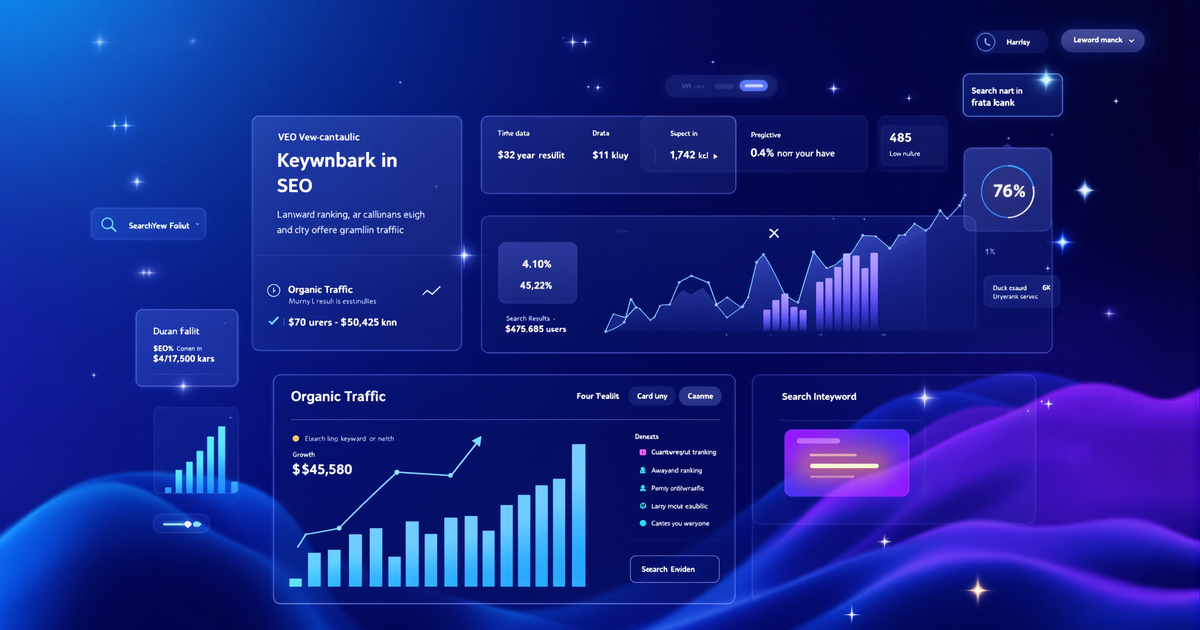
7. Interactive Dashboards: Monitor All Metrics in Real Time
Pain Point: Tired of switching between multiple tools or drowning in static reports?
How It Works: Interactive dashboards let you connect, blend, and visualize data from multiple sources (Google Analytics, Facebook Ads, CRMs, etc.) in one place. Filter by date, channel, or KPI to reveal trends instantly.
Example:
- Marketing agencies use dashboards to give clients a live view of campaign performance, budget pacing, and ROI—without the need for manual updates.
Actionable Tip:
- Set up role-based dashboards for execs, sales, and marketing to ensure each team sees the most relevant data.
Best Tools: Whatagraph, Domo, Klipfolio, Power BI, Tableau.
Bonus: 2025 Trends Shaping Marketing Data Visualization
- AI-Powered Data Storytelling: Tools now use AI to automate visualizations, identify key insights, and customize dashboards for different user needs. Expect more dynamic, personalized, and interactive visuals in 2025.
- Immersive & Real-Time Visuals: Marketers demand live updates, predictive analytics, and even AR/VR data experiences to make faster, more informed decisions.
Choosing the Right Visualization Tool for Marketers
Here are some leading platforms and their standout features:
- Power BI: Integrates seamlessly with Microsoft apps, great for real-time dashboards, and easy for beginners.
- Tableau: Renowned for design flexibility, advanced analytics, and sharing capabilities.
- Domo: User-friendly, 150+ chart types, and easy data integration.
- Infogram: Fast, branded visuals with interactive charts and team collaboration.
- Excel: Still a powerhouse for custom charts, pivot tables, and data blending—especially when paired with automation.
- Whatagraph & Looker Studio: All-in-one solutions for agencies needing to connect, blend, and share data from multiple sources.
Action Steps: How to Get Started Today
- Audit your current marketing reports. Are they telling a clear story, or just dumping numbers?
- Pick one visualization type from above and apply it to your top campaign or channel.
- Test and iterate. Ask colleagues for feedback: Does the visual make the insight clear?
- Choose a tool that matches your team’s needs—start with free trials of Tableau, Power BI, or Whatagraph to experiment.
Stop Guessing—Start Visualizing Your Growth
The gap between average and top-performing marketers is no longer who has the most data, but who can turn that data into action. With the right marketing data visualization examples and tools, you can unlock hidden growth, optimize campaigns, and make every marketing dollar count.
Ready to see what your marketing data is REALLY telling you?
👉 Take our Free 3-Minute Marketing Assessment and get a Custom Growth Plan now!
[Find Out EXACTLY What’s Missing in Your Marketing Strategy!] For more insights, check out our blog and learn more about us at CDM Suite. We also recommend this article on The Power Of Data Visualization In Digital Marketing from Forbes for further reading.